
To step back a little, humans have five senses; smell, sight, taste, touch and sound. An information-hungry shopper in a retail environment is tuned into all these senses. The most important of the 5, sight, provides 83% of the information to the customer and makes up 93% of the decision making process, and colour is an integral and influential part of sight.
How integral is it? Ponder these facts:
- 85% of shoppers place colour as a primary reason they buy a particular product.
- Colour increases brand recognition by 80%, which encourages consumer confidence.
- Memory retention studies tell us that consumers are up to 78% more likely to remember a word or phrase printed in colour than in black and white.
What is colour psychology?
Its the study of how environmental colour has an influence on behaviour.
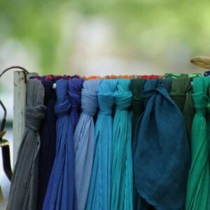
Colour is everywhere and yet you may not be aware of the vital role it plays in your life. It influences your thinking and alters your actions and reactions. It irritates, soothes, raises blood pressure and suppresses appetite.
Your new powertool.
When you, the shop owner, recognise the power of this tool at your disposal, you can also influence your customers. According to a report from GE Money women spend 8 years of their life shopping. That’s a lot of time they’re allowing themselves to be influenced! Any intelligent shop will use this time wisely to direct the spending their way.
Think before you act
As a retailer, you probably want customers to spend money. Depending on your store, ask yourself the following:
- Do you want them to spend money and leave fast, (such as a red fast food outlet) or do you want them to browse around before making a significant and valuable decision (such as an blue and white technology store)?
- What does your shop sell? Are there certain colours associated with the industry (e.g. white = clinical & clean = pharmacies)?
- Do you want your shop to be a calm environment (e.g. a luxury car sales yard) or a frenetic/urgent environment (e.g., a discount warehouse)?
Who do you sell to? Who do you want to sell to?
Bright colours appeal to youth, whereas more muted, mature shades are appreciated by the older generation (who have more money generally, but think through the decision-making process more).
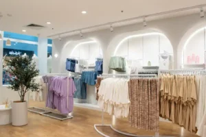
An item in bright packaging is seen as more affordable although not as high quality. Conversely, a sparsely filled shop, with restrained decoration and dark or pale colours, won’t welcome people whose budget is on the tight side. An impulse buyer relates more to bright colours, while a budget-conscious person gravitates to non-threating colours such as blue and green.
The Association of Colours
| Colour | Get It In Your Shop | Positive Associations | Possible Negative Associations |
| Red | strength, boldness, excitement, determination, desire, | Anger | |
| Orange | enthusiasm, cheerfulness, affordability, creativity, youth | Cheapness | |
| Yellow | attention-grabbing, liveliness, happiness, energy | Jealousy, lack of quality | |
| Green | durability, reliability, safety, honesty, harmony, freshness | Nausea, boredom | |
| Blue | depth, stability, finance, loyalty, reliability, hope, maturity | Depression, Sorrow | |
| Purple | power, nobility, luxury, royalty, elegance, magic | Confusion, distance | |
| Grey | conservatism, traditionalism, intelligence, seriousness | Tediousness, Dullness | |
| Brown | endurance, confident, casualness, earthiness, food | Dirtiness | |
| Black | sophistication, formality, strength, mystery, elegance | Death, gloom, emptiness | |
| White | cleanliness, purity, newness, peace, innocence, simplicity | Blandness |
It’s a big subject, but use it in your shop and you will reap benefits you didn’t know existed – who knows, maybe you’ll need to trademark ‘your’ colour like Cadbury has done.


